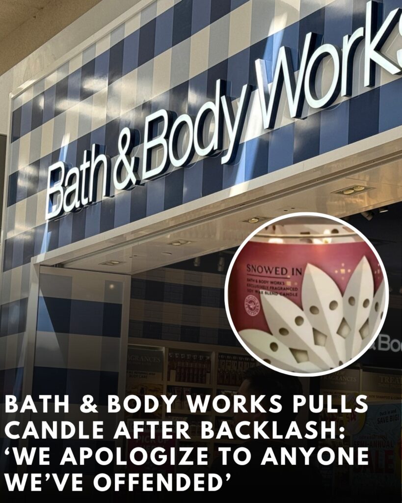
Bath & Body Works has withdrawn a winter-season candle from sale and issued an apology after customers said the design on its packaging resembled the hoods and robes associated with the Ku Klux Klan. The three-wick product, sold under the name “Snowed In,” appeared briefly online and in stores before being pulled once the complaints surfaced. In a statement, the company said the resemblance was unintended and promised to examine how the design was approved, adding: “We apologize to anyone we’ve offended and are swiftly working to have this item removed and are evaluating our process going forward.”
The controversy centres on the printed motif that circled the jar. The artwork was meant to depict a paper snowflake—an image commonly used in the brand’s holiday line—but the way the shapes were rendered gave some shoppers a starkly different impression. Along the label’s perimeter, a series of white, cone-like points angle inward, and near the centre of each are two small circular cut-outs. Shoppers photographed and filmed the label, then compared it to the pointed white hoods and eye slits synonymous with the Klan. Within hours, images of the candle were circulating across Instagram and X, where users debated whether the design was an obvious error that should have been caught or an example of social media seeing offence where none was intended. Bath & Body Works removed the product listing and told customers it had initiated the pull across channels.
The firm’s statement sought to close down speculation about intent while acknowledging the perception problem. While the label was conceived as a snowflake cut-out, the brand said, the visual outcome missed the mark for some viewers. That gap between artistic intention and public reception—especially when the imagery is adjacent to a hate symbol—triggered a swift corporate response. The company’s commitment to “evaluating our process going forward” indicates the incident will feed into pre-launch checks, including more rigorous review of seasonal artwork and sensitivity vetting for designs that use stylised geometric shapes. The decision to apologise without qualification and to withdraw the product rather than simply edit the listing or change its description underlines how quickly consumer-facing brands are now moving when criticism coalesces online.
The blowback formed in the space where seasonal consumer branding intersects with America’s unresolved history of racist terror. The Klan’s pointed white hood and robe are not merely historical costume; for many Americans they remain an active symbol of intimidation, violence and segregation. When abstractions or decorative motifs echo that silhouette, even inadvertently, the association can overpower any benign intention. That dynamic has forced companies across sectors to conduct stricter pre-release reviews of iconography, logos and patterns, particularly when repeating shapes or negative space can be read in multiple ways. The debate around “Snowed In” followed that template: some social media users insisted the resemblance was obvious, while others said they would never have seen it without prompting and argued it looked like nothing more than a clumsy snowflake. In one exchange cited by news outlets, comments ranged from “This wasn’t an accident” to “It’s just a poorly executed design that shouldn’t have been approved,” highlighting both the suspicion of intent that often attaches to such controversies and the more pragmatic critique of quality control.
The episode unfolded at the start of the holiday retail cycle, when Bath & Body Works typically drives heavy footfall with seasonal fragrances and giftable accessories. The company’s three-wick candles are among its most recognisable products, promoted through store-wide sales and dedicated “Candle Day” events that can generate substantial social chatter and in-store queues. That visibility, however, also ensures any misstep spreads quickly. In this case, the label’s design—visible at a glance on endcaps and in online thumbnails—allowed shoppers to share screenshots and close-ups that stripped the product of marketing context and invited a blunt, viral comparison. The brand’s decision to pull the candle across channels suggests it judged the reputational risk to outweigh the sales benefit of keeping the item available while a redesign was considered.
Bath & Body Works has framed the issue as a process failure rather than an isolated lapse. The promise to review approvals puts a spotlight on the internal journey an image takes before it reaches the shelf: from concept brief to illustrator’s first drafts; from packaging layout to pre-press proofs; through marketing sign-off and merchandising plans. At any of those points, a reviewer might have flagged the way the negative space and circular “eye” cut-outs could be interpreted once scaled and wrapped around a glass cylinder. Packaging that repeats a shape around a circumference, as candle labels do, can accentuate patterns and create composite forms that don’t appear in a flat mock-up. The incident will likely prompt companies in similar categories to pressure-test designs under the same conditions shoppers will encounter them—curved glass, shelf distance, and low-light ambience—before final approval.

The removal also reflects the expanding definition of corporate responsibility in the consumer goods sector. Where brands once defended intent, they now increasingly measure success by impact: if a significant number of customers experience a design as offensive, the argument that the offence was unintended rarely carries weight. For Bath & Body Works, the apology and withdrawal signal alignment with that standard. The company did not attempt to litigate whether a certain number of shoppers were mistaken; it accepted the perception as sufficient cause to act. That approach has become more common in the “fast feedback” era, when a day of social media videos can reshape a product narrative more quickly than a brand can push out a clarifying blog post.
The candle’s name—“Snowed In”—is part of the brand’s winter palette of titles designed to evoke cosy, neutral imagery. The choice of a paper snowflake as a graphic element would ordinarily be considered risk-free. But stylisation matters. Many paper snowflakes are rendered with six-point symmetry and delicate cut-outs; the label in question used broad, tapering white wedges that culminated in points, with paired circular voids. Once a viewer sees a hood and eyeholes, the association can become difficult to unsee, as several commenters noted. That psychological effect explains why brands are cautious about abstract forms that can resolve into charged images under certain angles or when tiled around an object.
For shoppers, the practical consequences are straightforward: the product is no longer available for purchase online, and stores have been instructed to remove remaining inventory. In previous instances of packaging withdrawals—across the industry rather than specific to this company—retailers have typically directed staff to quarantine stock in the back room pending vendor collection or to mark items unsellable in inventory systems. Customers who bought the candle before the withdrawal may attempt returns; the company has not publicly issued a blanket recall notice or a dedicated returns protocol beyond its existing policies, and there has been no suggestion of a safety defect. The issue is presentation rather than product performance, and the company has limited its public statements to apology and removal.
The timing adds sensitivity. Over recent years, several household-name brands have faced criticism over names, graphics or marketing imagery that consumers linked to racist caricatures or symbols. The retail response has evolved from defensive explanations to proactive change, with companies preferring to over-correct than to spend weeks in reputational triage. In that context, Bath & Body Works’ decision to pull a single label within a vast seasonal assortment is a relatively low-cost intervention aimed at signalling awareness and respect for concerns, even where intention is disputed. In parallel, the company has previously highlighted corporate programmes aimed at diversity, equity and inclusion, and charitable support for civil rights organisations—background that does not mitigate a design misstep but does form part of how stakeholders assess whether a brand is acting consistently with its stated values.
Social reaction illustrated the polarisation that now accompanies design flare-ups. Some users framed the label as an obvious allusion, questioning how it could have passed through internal review without anyone raising an alarm. Others urged caution, arguing that outrage culture presses neutral shapes into inflammatory meanings and that the snowflake interpretation was clear enough. The company’s choice to remove the candle rather than contest the point head-on brought that debate to a close, at least in operational terms, and shifted the focus to what guardrails will be installed to prevent a recurrence. The speed of the decision also blunted the cycle that often follows such incidents, where brands spend days watching screenshots ricochet between platforms while preparing a more fulsome corporate response.
What happens next sits largely behind the scenes: a root-cause review of the design path; updates to style guides and “what to avoid” glossaries; and potentially a requirement that any pattern incorporating pointed white shapes and eye-like cut-outs receives senior sign-off. Vendors and external design partners can expect revised briefs that specify not only what a motif should be, but what it must not even plausibly evoke when repeated or viewed at distance. For a brand with hundreds of seasonal SKUs, the operational burden of that extra layer is modest compared with the reputational cost of another misstep. The candle category, in particular, relies on packaging to differentiate scents that consumers may not be able to smell before purchase; labels are photographed, unboxed on video, and saved in collections, amplifying any design gamble that backfires.
The withdrawal will be studied by competitors, which face similar pressures to deliver novelty without courting inadvertent controversy. The lesson is as much about execution as concept. Snowflake imagery is ubiquitous in winter retail, but the specific geometry here—tapered cones and paired holes—proved vulnerable to a loaded reading once tiled around a curved surface. Substituting softer, rounded motifs or avoiding bilateral “eye” shapes in the same relative position may now become an informal rule-of-thumb for holiday packaging across the sector. In the short term, Bath & Body Works will want to re-centre conversation on core seasonal launches and its high-profile promotions, ensuring photographs and store displays emphasise designs that feel unmistakably festive. Longer term, the brand’s willingness to reverse course quickly may be read by customers as a sign that feedback is taken seriously, a message many retailers have tried to cultivate as social platforms have become de facto customer-service channels.
For those who did not see the resemblance, the episode may look like a case of over-interpretation. But for those who did, even a fleeting association with a symbol of racial hatred is a powerful deterrent to purchase and a legitimate reason to expect accountability from a national brand. Bath & Body Works’ apology avoids defensiveness and rests on a straightforward principle: the effect of a design on the people who buy and display it matters at least as much as the designer’s original intention. By pulling the candle and pledging to refine its process, the company has taken the practical steps available to it now. Whether that is viewed as a model response or an avoidable error will depend on what its next holiday range looks like—and whether the only thing customers see in those designs are snowflakes.